The # became a portal.
SoloMD 4.11.3 has a new logo. We kept the one character that says Markdown without explanation, removed the generic letters around it, and opened a small portal at its center.

Markdown structure outside. An opening for ideas, files and agents inside.
What the old mark got right
The original #MD mark was direct. It told you what the app
opened before you knew its name, and the orange hash gave SoloMD a
recognizable color from day one. That clarity was worth keeping.
But it was still a word set in a font. At dock size, the letters merged
into a white bar. In a browser tab they disappeared. And MD
described a file extension more than a product that had grown into a
workspace for notes, diagrams, local AI and publishing.
NOW · a symbol Why a portal?
A hash is Markdown's most familiar piece of structure: one character turns a line into a heading and gives a document shape. We redrew that hash from four solid geometric strokes, then cut a warm-paper diamond into the center. The diamond reads as a cursor, a spark, a vault opening or a doorway depending on its size. All four interpretations belong in SoloMD.
The result still says “Markdown” at a glance, but it also points forward. SoloMD is where plain files open into something larger: a linked vault, a publishable document, a diagram, or a workspace an agent can help with. The logo does not abandon the file. It shows the opening inside it.
Drawn, not typed
Every visible part of the mark is original geometry. There is no logo font and no borrowed glyph. That gives us a shape we can own, tune and reproduce consistently from a 16-pixel browser tab to a 1024-pixel store listing. The graphite square keeps the app grounded; the same SoloMD orange keeps continuity with every previous release.
One identity, two jobs
The app icon and a Markdown file should feel related without becoming indistinguishable. The app gets the dark # Portal: the tool and the doorway. Documents get a warm paper sheet, an orange folded corner and the Portal as a smaller seal, with two quiet text lines beneath it. Finder can now tell “open SoloMD” from “open this note” at a glance.
App The portal 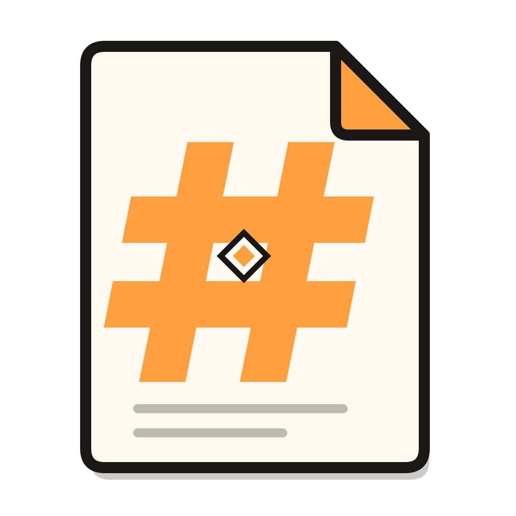 Document The page
 What changed, and what did not
The new identity now ships across macOS, Windows, Linux, iOS, Android, installers, store artwork, document associations and this website. What did not change is more important: SoloMD is still free, MIT-licensed, local-first, built around ordinary files, and orange in exactly the same slightly warm way.
A good software logo should become boring in the best sense: easy to find, hard to mistake, and quiet enough to live beside your work every day. That is what this one is designed to do.
The new mark ships in SoloMD 4.11.3. Download it here.
Comments & feedback
Comments live on GitHub Discussions — sign in once with your GitHub account.
Comments load from GitHub Discussions. If you see this message instead, the maintainer has not finished the one-time giscus.app setup yet — see web/COMMUNITY-SETUP.md.
Open on GitHub Discussions →